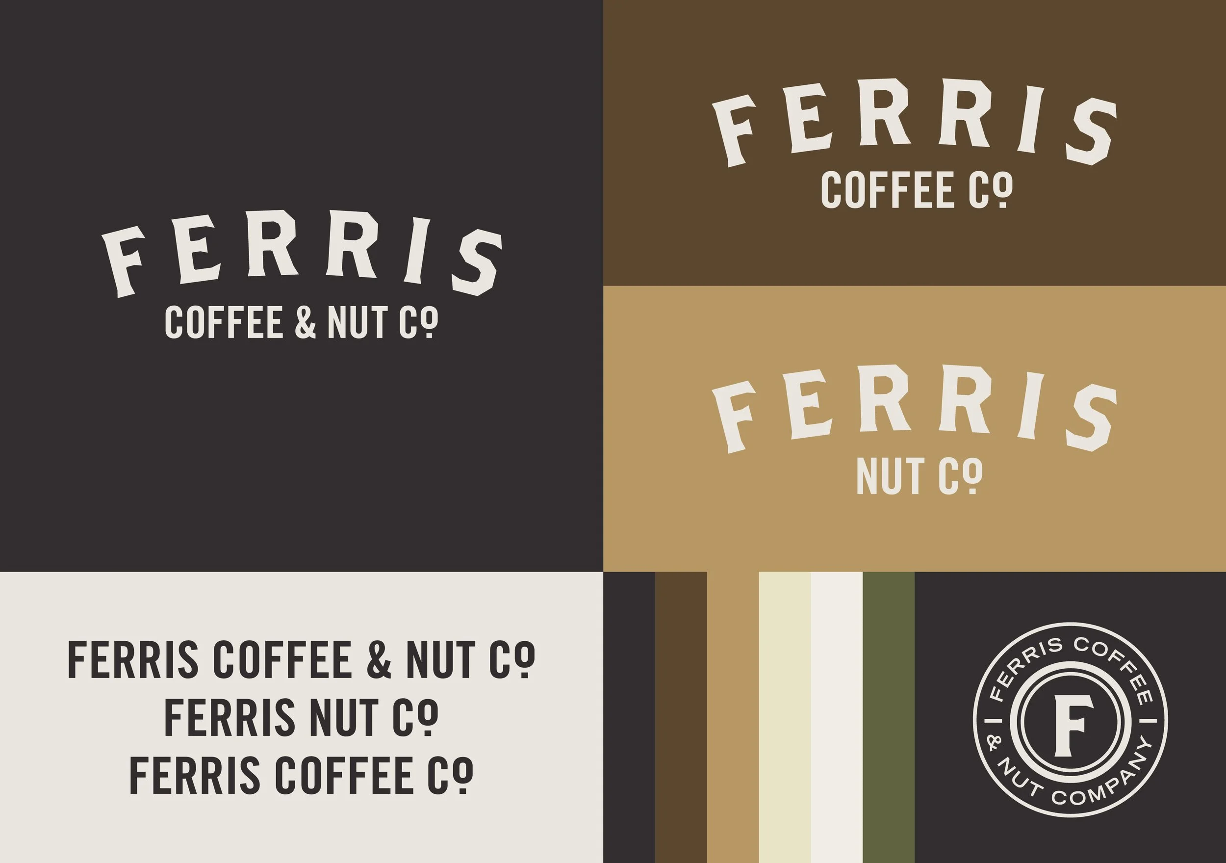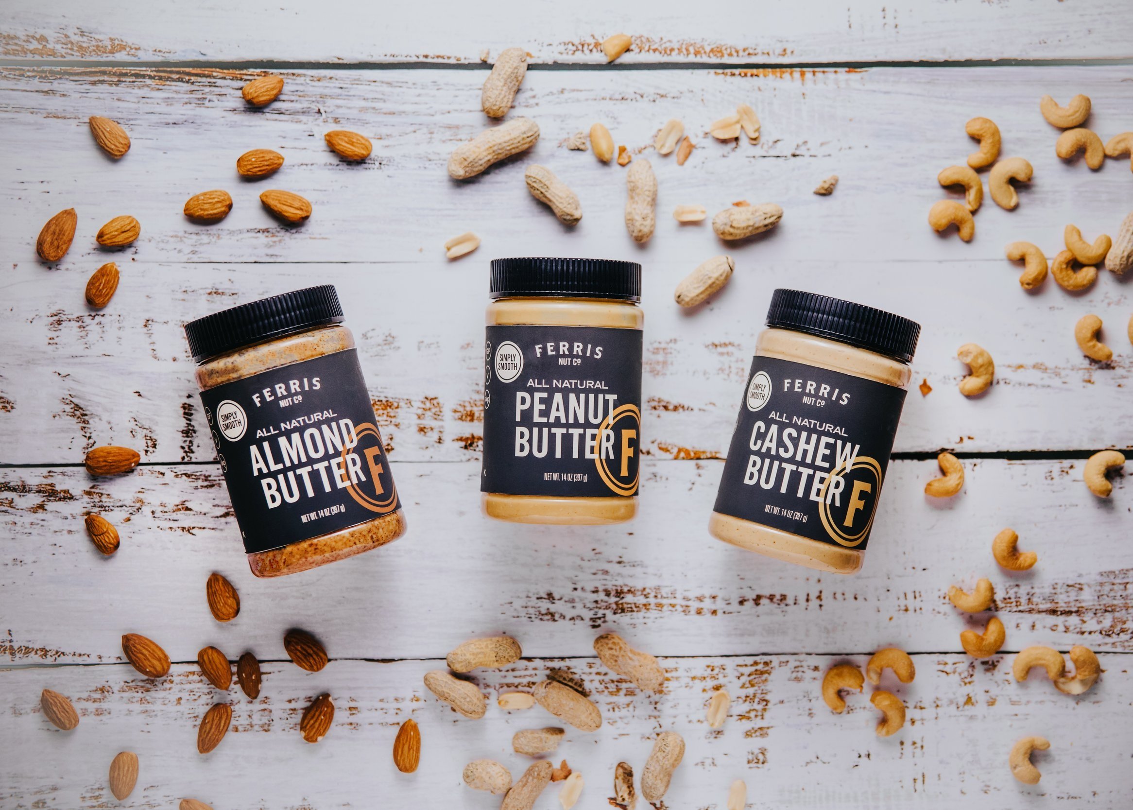
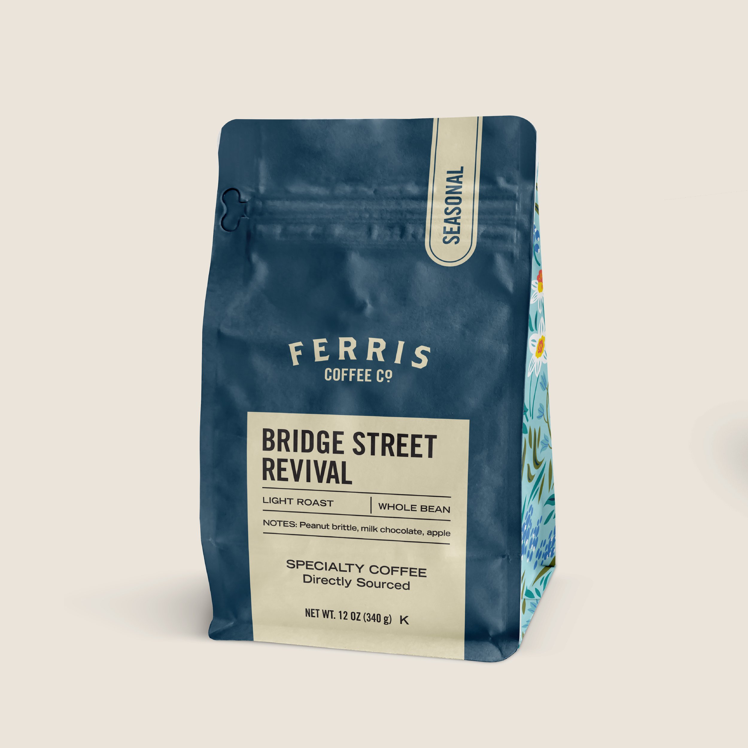
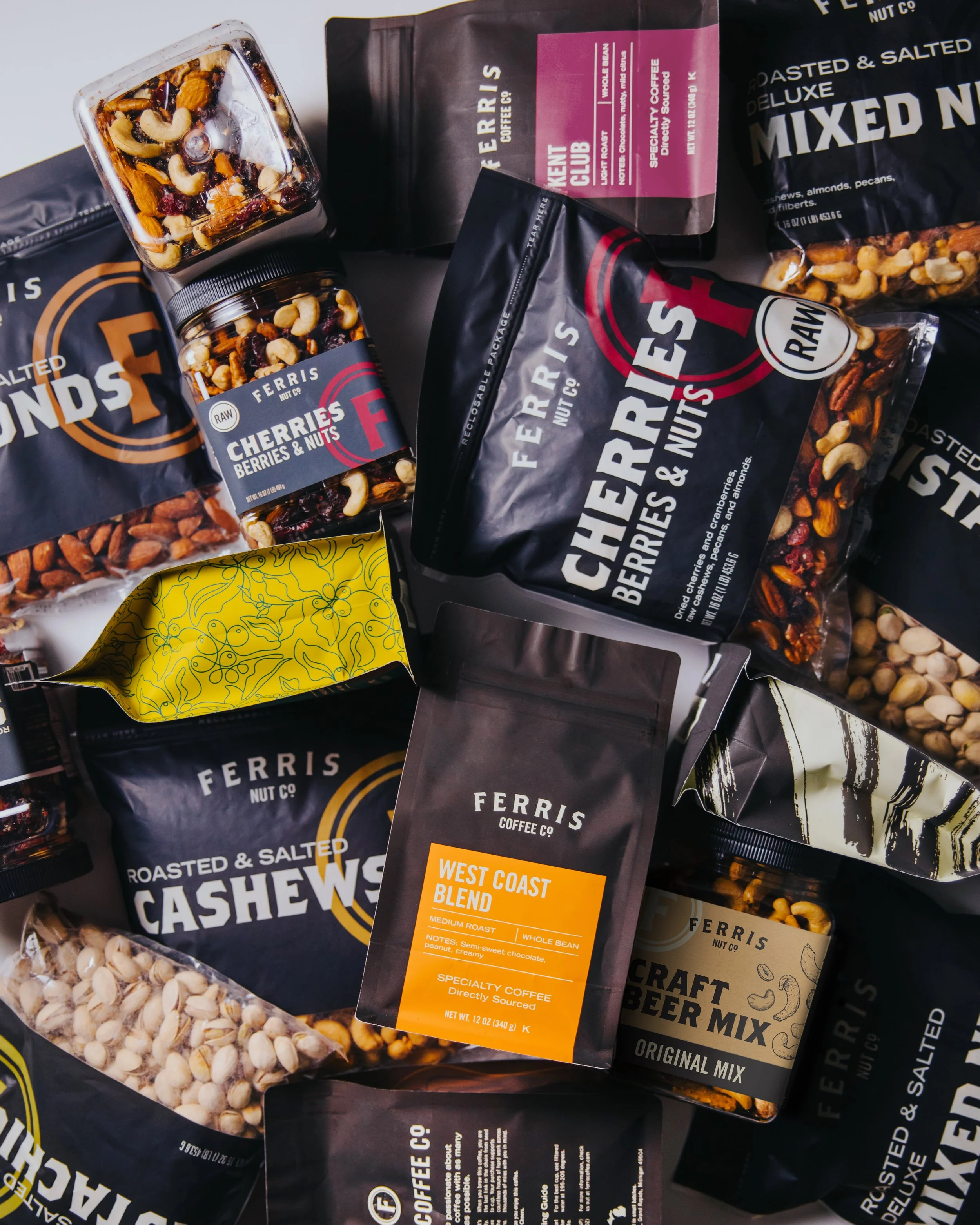
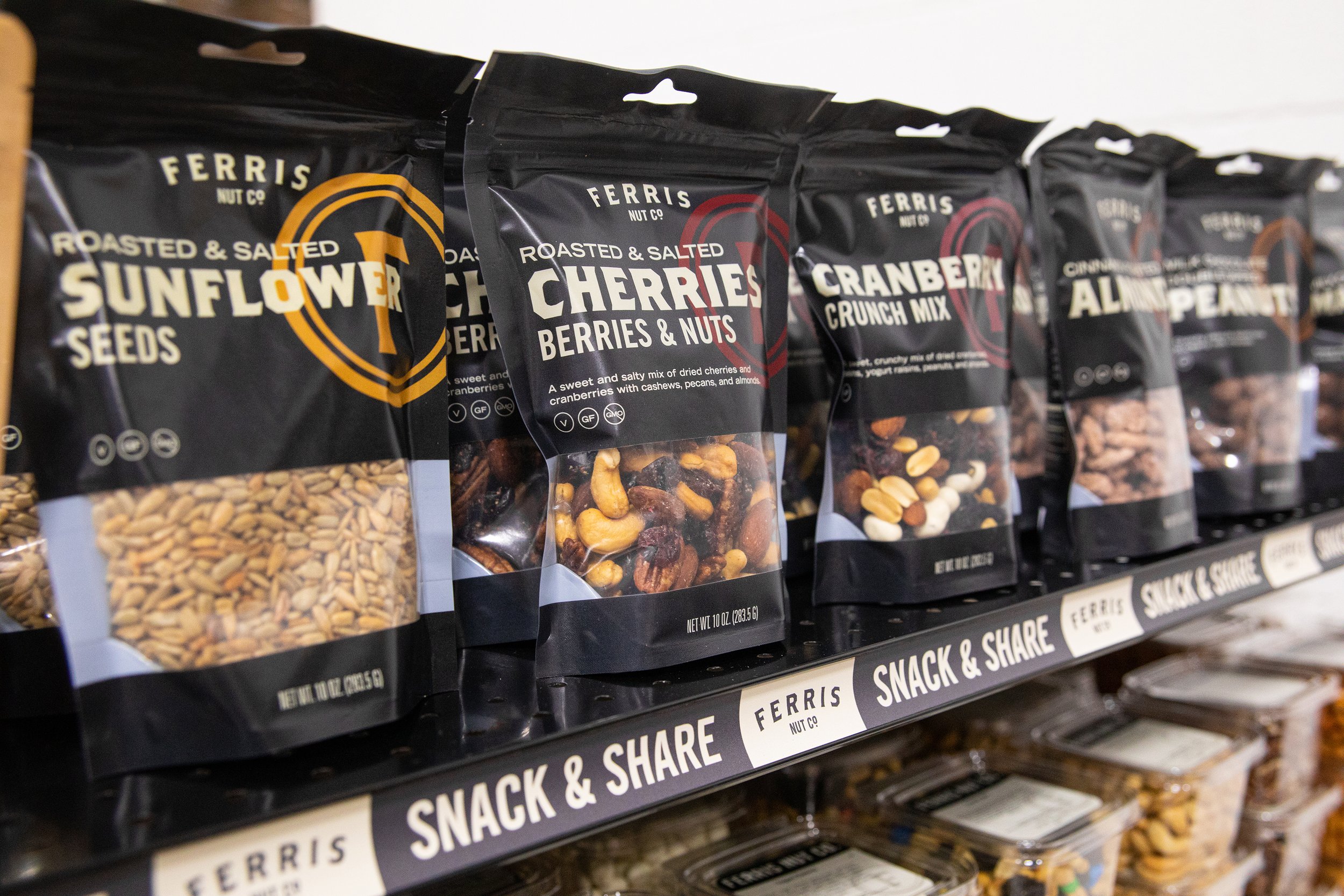
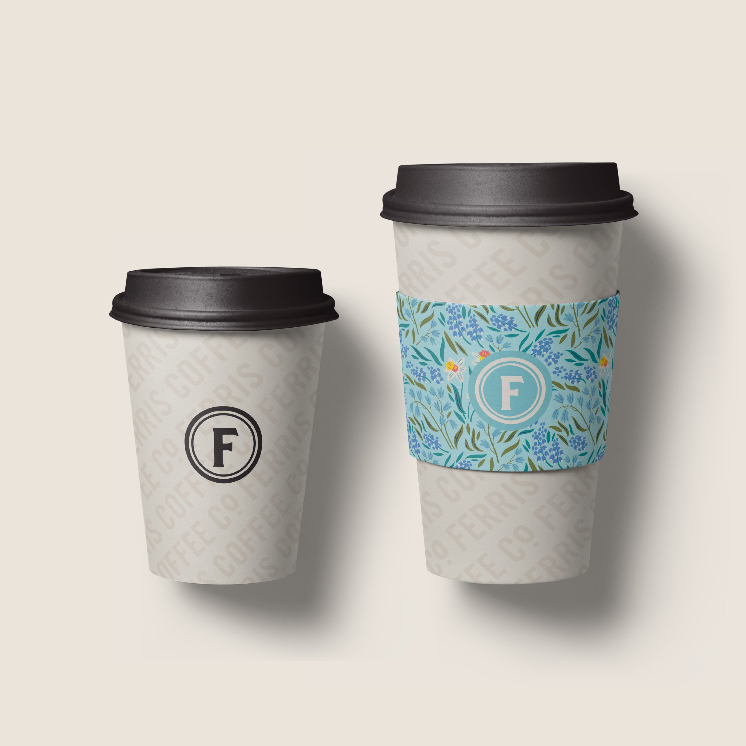
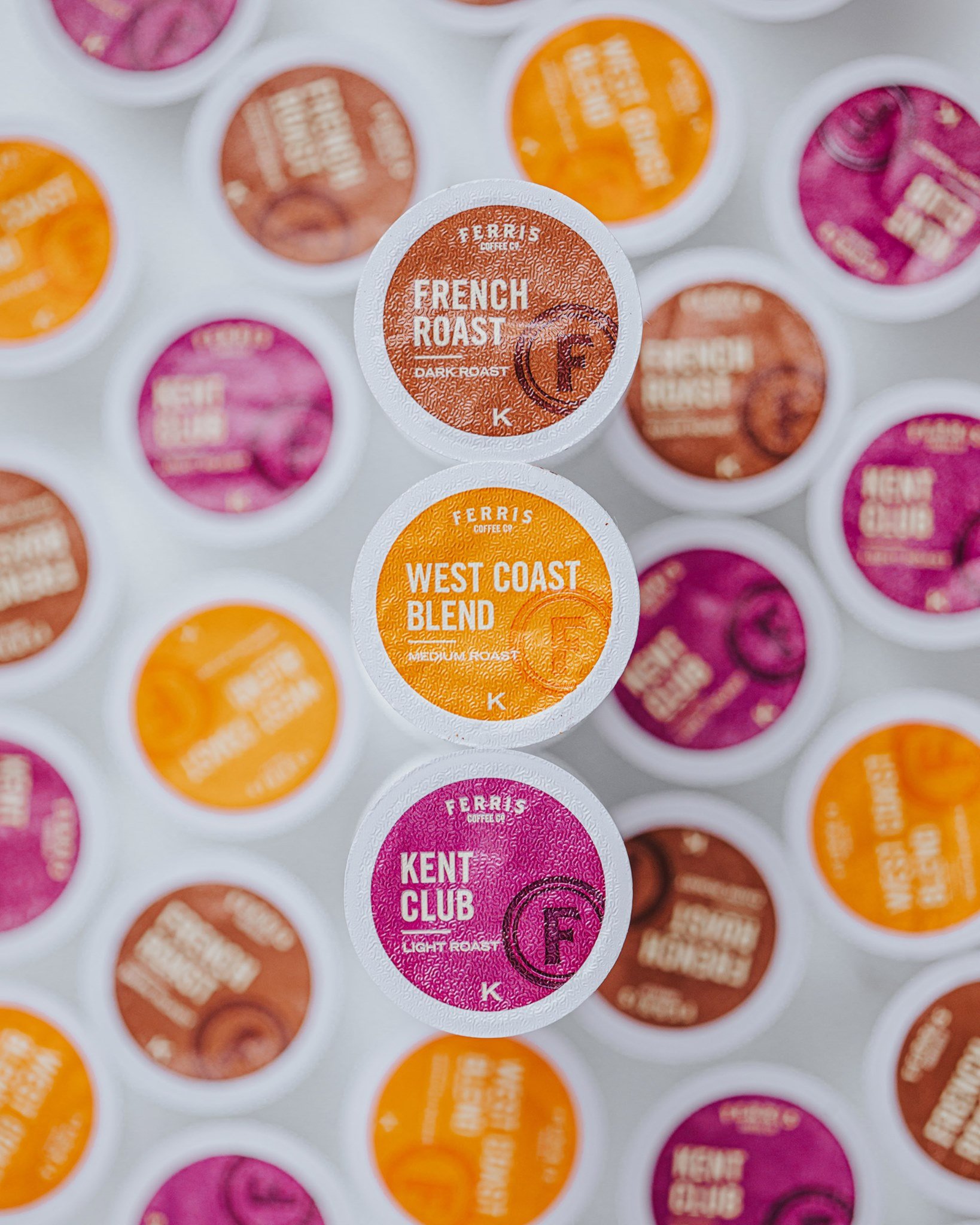
Ferris Coffee & Nut Co. is a family-owned roaster in Grand Rapids, Michigan. After over 95 years of sourcing and roasting the best specialty coffees and gourmet nuts, Ferris was in need of a brand refresh and total packaging overhaul. The primary goal of this new look was to renew and unify the brand which had been diluted across varied product lines and disparate packaging approaches over the years.
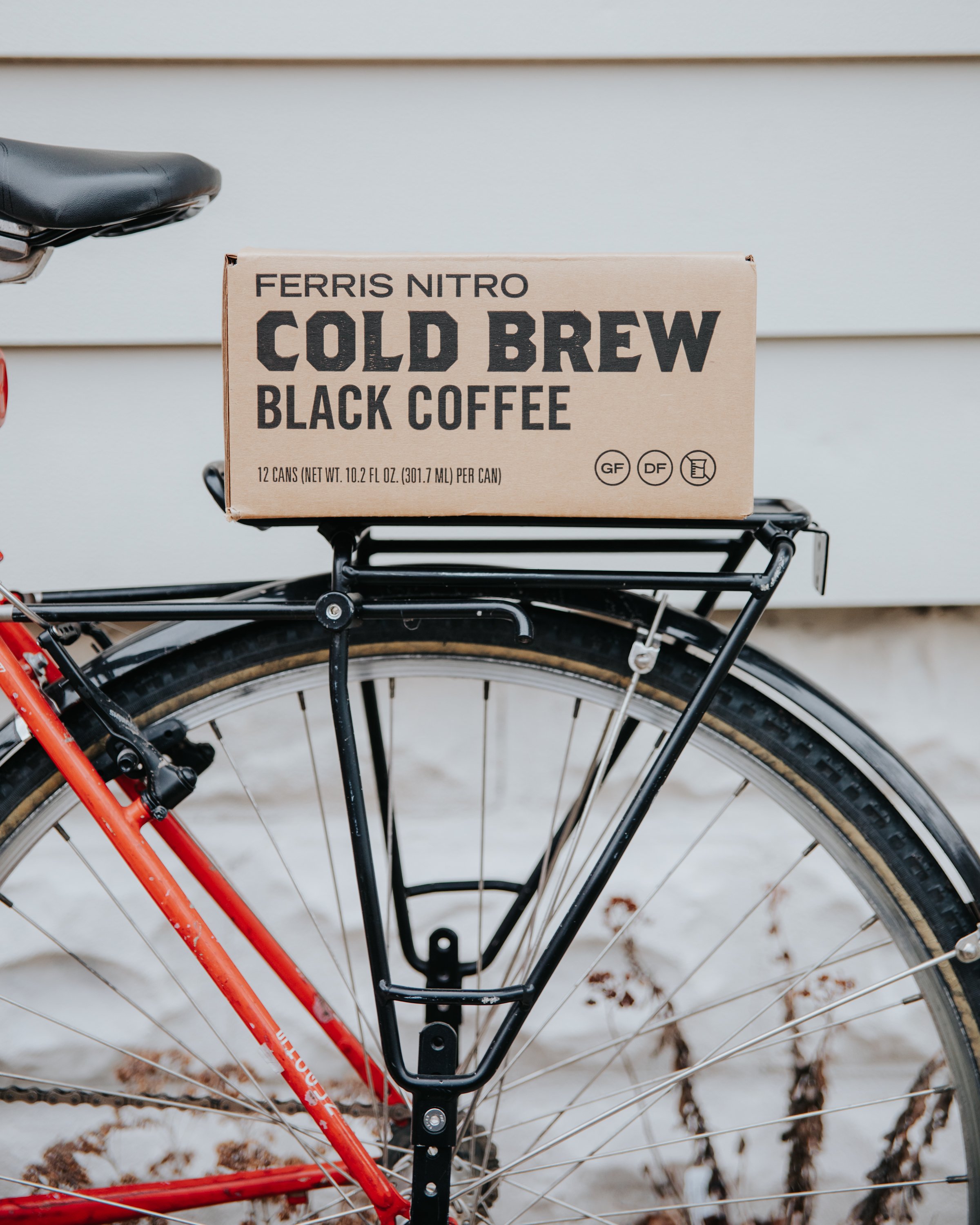
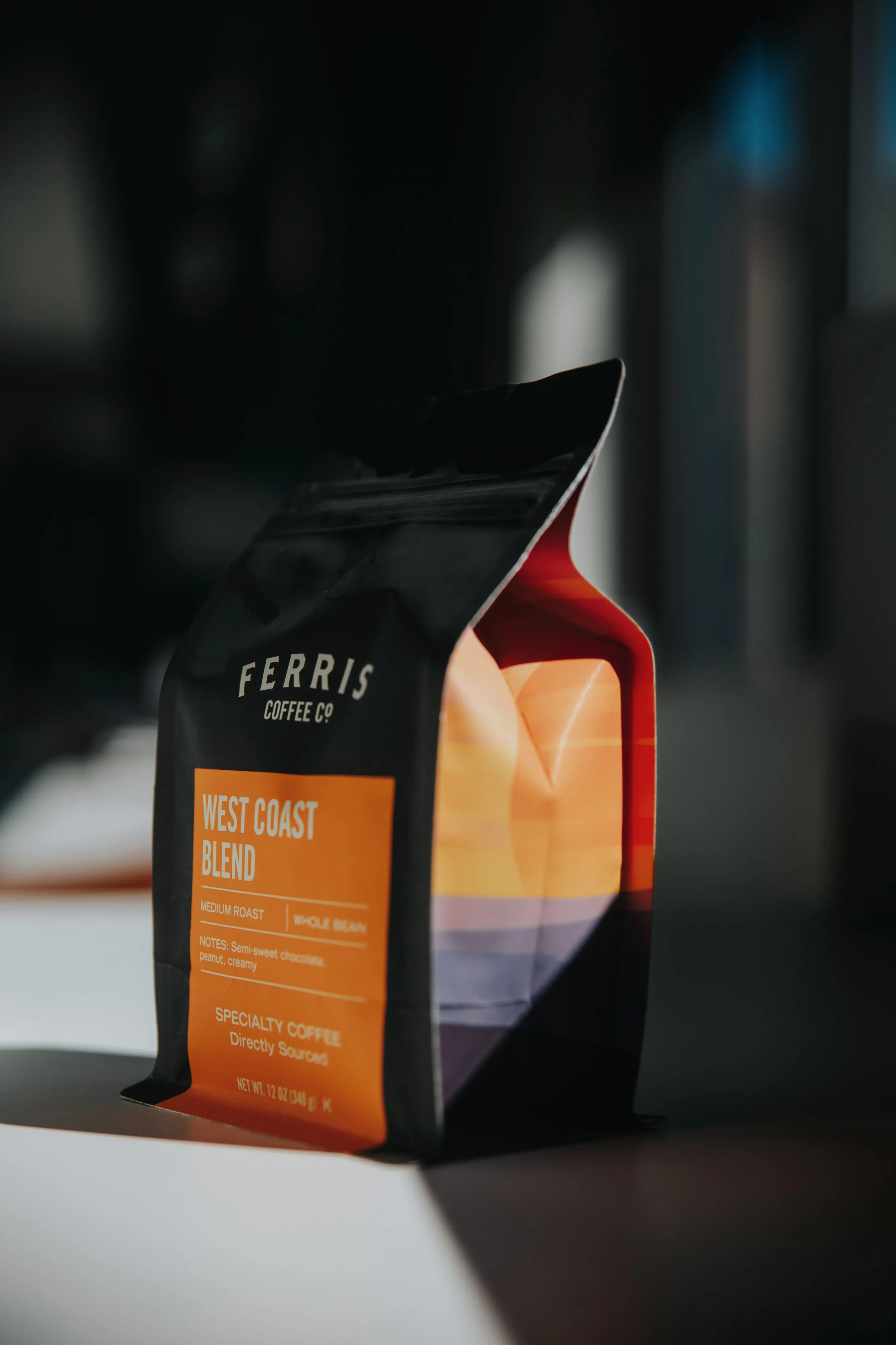
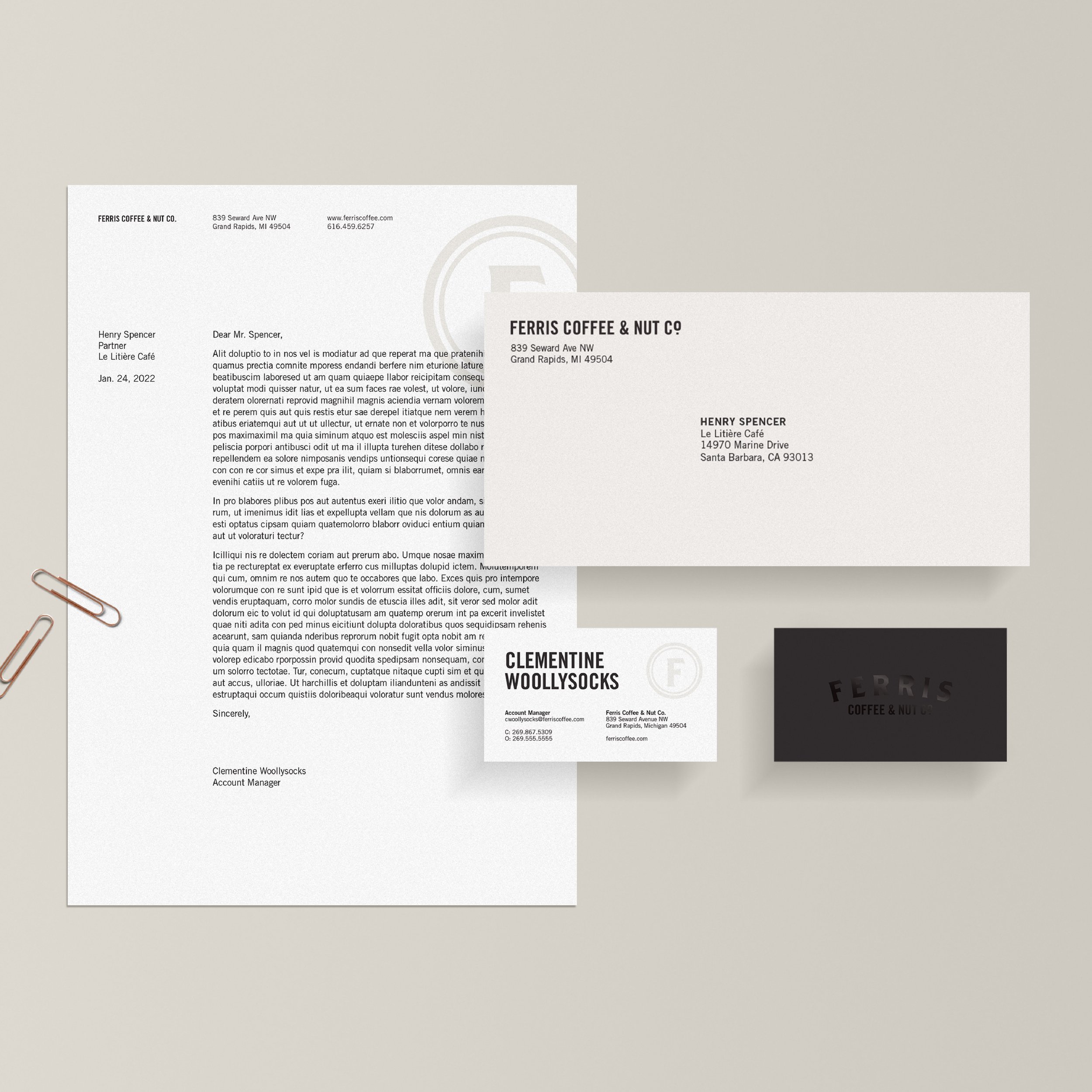
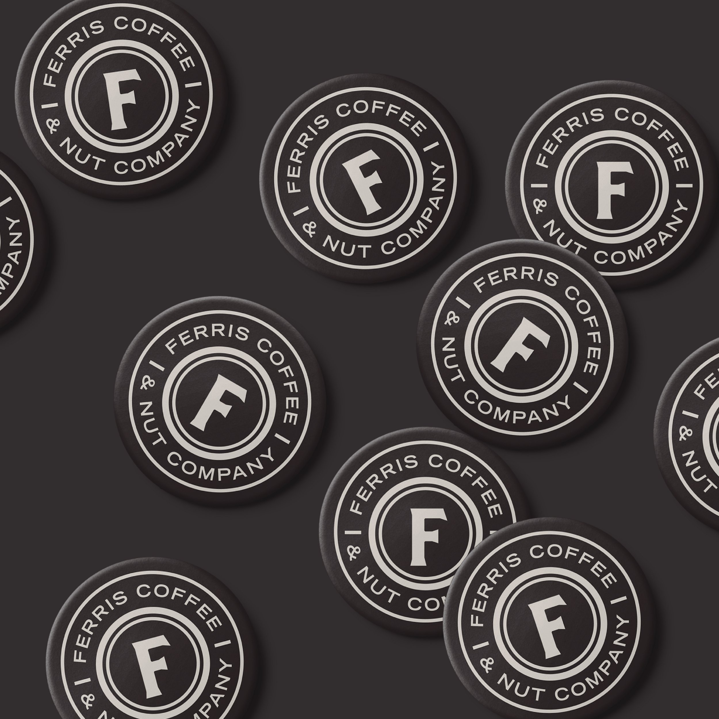
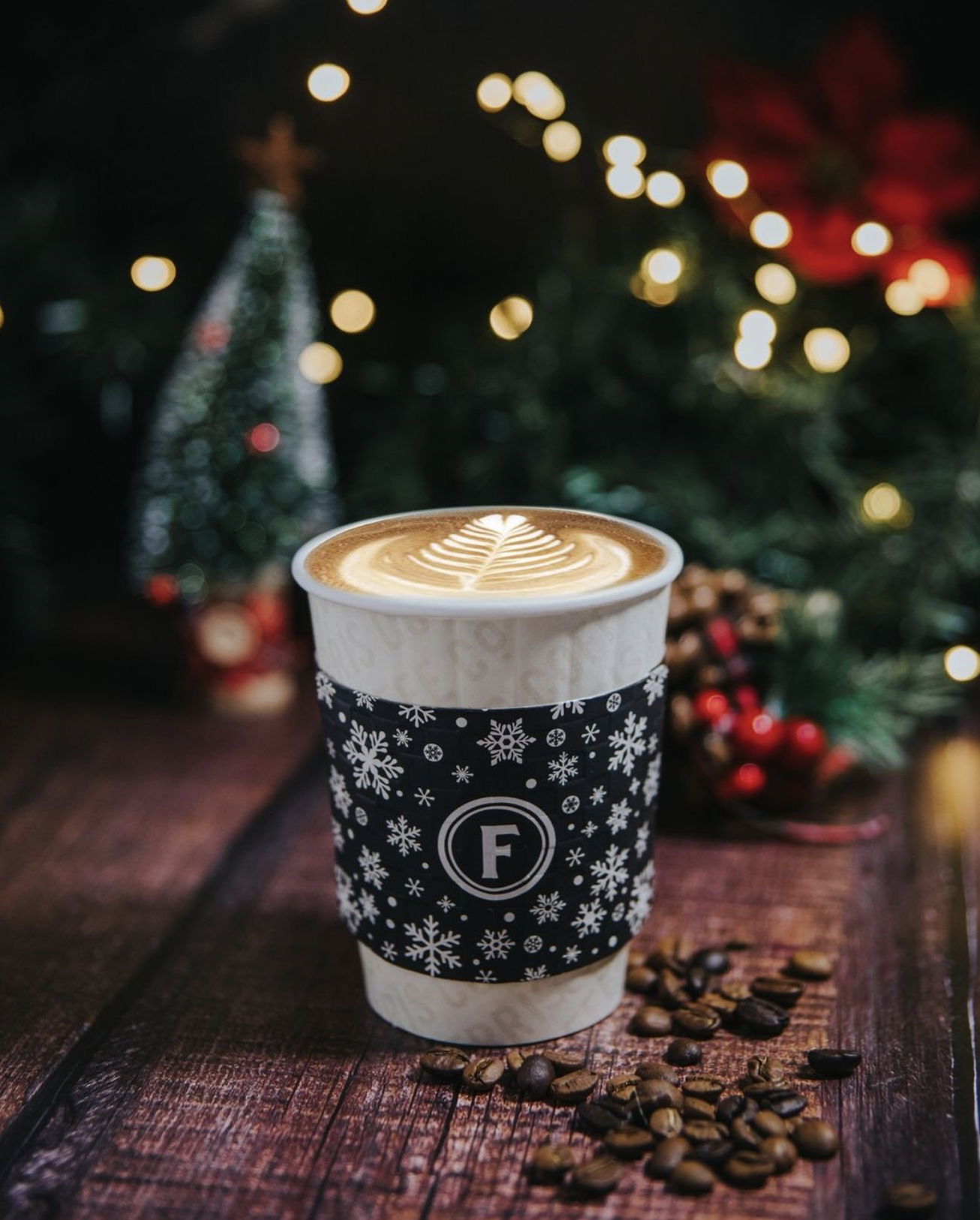
When beginning this process, Ferris was concerned with retaining the legacy and brand equity inherent to their original logo. So I gave it a soft refresh, cleaning up the existing design and adding new lockups for more versatility. From there we moved into a line by line packaging overhaul and rounded out the updates with new designs for stationery, apparel, swag, and sub-brands as well as brand touchpoints across their cafes. The overall design approach was to create an elevated new look while bringing along some classically “Ferris” elements for a brand that feels cultivated and current, but with the warmth and weight of its experience and history behind it.
Photography courtesy of Ferris Coffee & Nut Co.












Sub-brand – Deli/Cafe run by Ferris

Sub-brand – Ferris rewards program
